![]()
使用 sktime 和 skchange 进行异常点、变化点和分段检测#
[ ]:
import datetime
import pathlib

import matplotlib.pyplot as plt
import pandas as pd
检测模块(“标注”)概述#
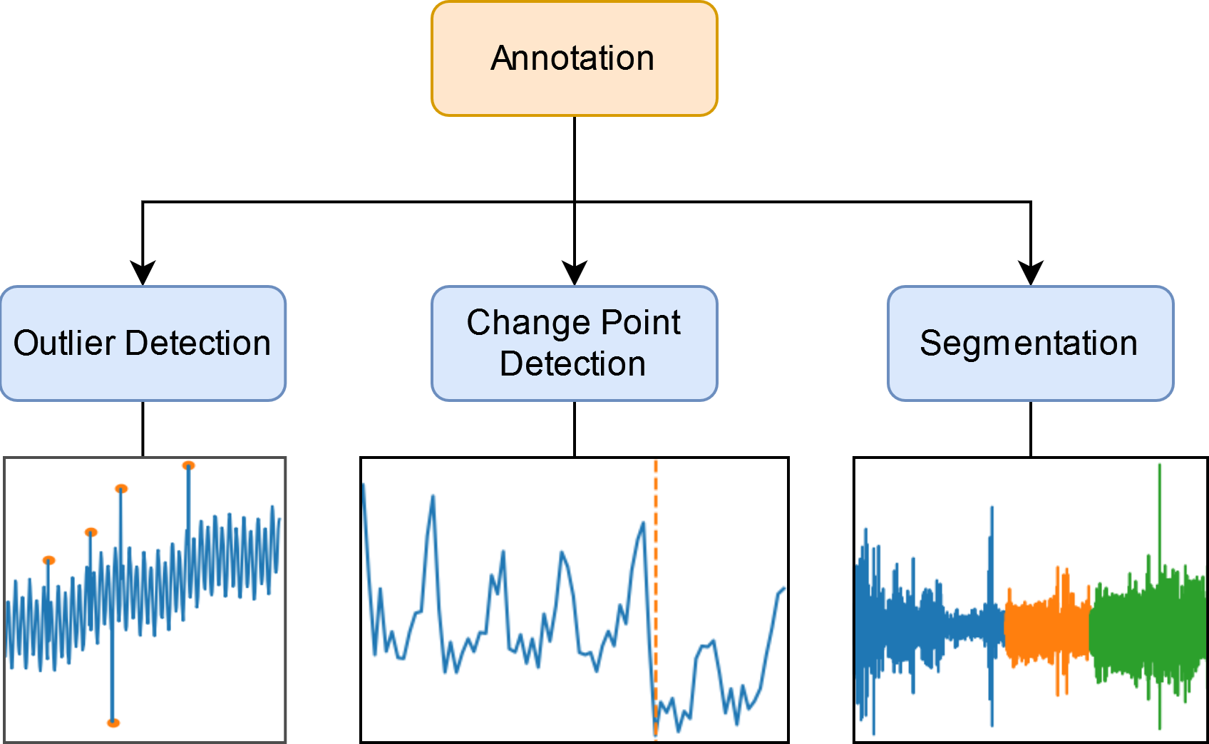
异常值检测
移除不切实际的数据点。
查找感兴趣的点或区域。
变化点检测
检测数据生成方式的显著变化。
分段
查找异常点序列。
在数据集中查找常见模式或基序。
异常值类型#
点异常值:与整个时间序列(全局)或相邻点(局部)相比不寻常的单个数据点。
子序列异常值:与其它序列相比不寻常的个体点序列。
查找异常时间序列。
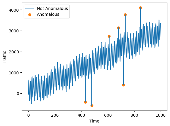
检测点异常值#
如果一个数据点与时间序列的其余部分相比极高或极低,则它是一个点异常值。我们将训练一个模型来检测 Yahoo 数据集上的点异常值。
Yahoo 时间序列包含带标签的合成异常。实际上,异常值检测通常是一个无监督学习任务,因此通常不提供标签。
[2]:
data_root = pathlib.Path("../sktime/datasets/data/")
df = pd.read_csv(data_root / "yahoo/yahoo.csv")
df.head()
[2]:
| 数据 | 标签 | |
|---|---|---|
| 0 | -46.394356 | 0 |
| 1 | 311.346234 | 0 |
| 2 | 543.279051 | 0 |
| 3 | 603.441983 | 0 |
| 4 | 652.807243 | 0 |
绘制时间序列。
[3]:
fig, ax = plt.subplots()
ax.plot(df["data"], label="Not Anomalous")

mask = df["label"] == 1.0
ax.scatter(
    df.loc[mask].index, df.loc[mask, "data"], label="Anomalous", color="tab:orange"
)

ax.legend()
ax.set_ylabel("Traffic")
ax.set_xlabel("Time")
fig.savefig("outlier_example.png")
Sktime 提供了几种异常检测算法。STRAY 就是其中一种算法。
[4]:
from sktime.detection.stray import STRAY

model = STRAY()
model.fit(df["data"])
y_hat = model.transform(df["data"])  # True if anomalous, false otherwise
y_hat
[4]:
0      False
1      False
2      False
3      False
4      False
       ...
995    False
996    False
997    False
998    False
999    False
Name: data, Length: 1000, dtype: bool
使用 sum 查找已检测到的异常数量。
[5]:
y_hat.sum()
[5]:
3
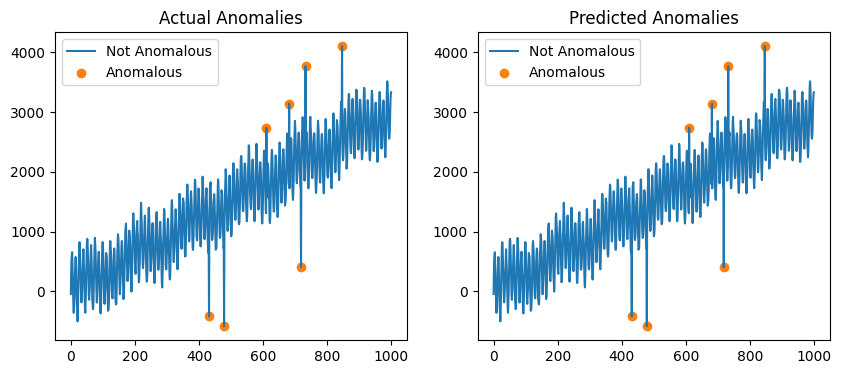
绘制预测的异常。
[6]:
fig, ax = plt.subplots(1, 2, figsize=(10, 4))

# Plot the actual anomalies in the first figure
mask = df["label"] == 1.0
ax[0].plot(df["data"], label="Not Anomalous")
ax[0].scatter(
    df.loc[mask].index,
    df.loc[mask, "data"],
    color="tab:orange",
    label="Anomalous",
)
ax[0].legend()
ax[0].set_title("Actual Anomalies")

# Plot the predicted anomalies in the second figure
ax[1].plot(df["data"], label="Not Anomalous")
ax[1].scatter(
    df.loc[y_hat].index,
    df.loc[y_hat, "data"],
    color="tab:orange",
    label="Anomalous",
)
ax[1].legend()
ax[1].set_title("Predicted Anomalies")
[6]:
Text(0.5, 1.0, 'Predicted Anomalies')
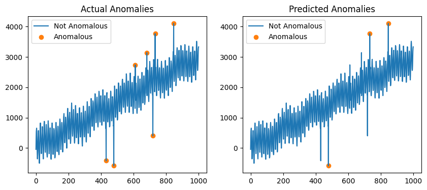
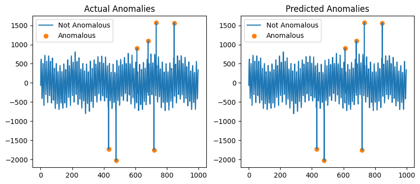
STRAY 是 KNN 算法的修改版本。它无法处理时间序列中的趋势,因此只有最大值和最小值被标记为异常。
Sktime 提供了可与 STRAY 一起使用的趋势去除方法。
[7]:
from sktime.transformations.series.detrend import Detrender

X_detrended = Detrender().fit_transform(df["data"])

model = STRAY()
model.fit(X_detrended)
y_hat = model.transform(X_detrended)

fig, ax = plt.subplots(1, 2, figsize=(10, 4))
ax[1].plot(X_detrended, label="Not Anomalous")
ax[1].scatter(
    X_detrended.loc[y_hat].index,
    X_detrended.loc[y_hat],
    color="tab:orange",
    label="Anomalous",
)
ax[1].legend()
ax[1].set_title("Predicted Anomalies")

ax[0].plot(X_detrended, label="Not Anomalous")
ax[0].scatter(
    X_detrended.loc[df["label"] == 1.0].index,
    X_detrended.loc[df["label"] == 1.0],
    color="tab:orange",
    label="Anomalous",
)
ax[0].legend()
ax[0].set_title("Actual Anomalies")
[7]:
Text(0.5, 1.0, 'Actual Anomalies')
使用 * 运算符执行此操作还有一种更简单的方法。
[8]:
pipeline = Detrender() * STRAY()
pipeline.fit(df["data"])
y_hat = pipeline.transform(df["data"])

fig, ax = plt.subplots(1, 2, figsize=(10, 4))
ax[1].plot(df["data"], label="Not Anomalous")
ax[1].scatter(
    df.loc[y_hat, "data"].index,
    df.loc[y_hat, "data"],
    color="tab:orange",
    label="Anomalous",
)
ax[1].legend()
ax[1].set_title("Predicted Anomalies")

ax[0].plot(df["data"], label="Not Anomalous")
ax[0].scatter(
    df.loc[df["label"] == 1.0, "data"].index,
    df.loc[df["label"] == 1.0, "data"],
    color="tab:orange",
    label="Anomalous",
)
ax[0].legend()
ax[0].set_title("Actual Anomalies")
[8]:
Text(0.5, 1.0, 'Actual Anomalies')
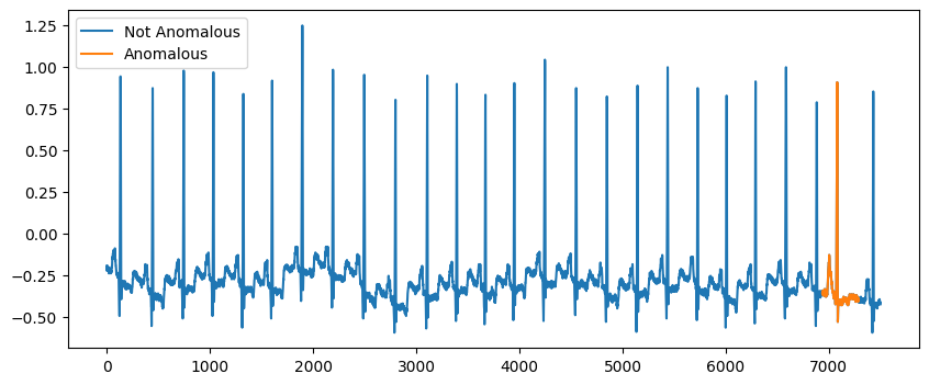
检测子序列异常值#
子序列异常值是连续点组,其行为异常。mitdb.csv 数据集是一个心电图数据集,包含一个子序列异常值的示例。
[9]:
path = pathlib.Path(data_root / "mitdb/mitdb.csv")
df = pd.read_csv(path)
df.head()
[9]:
| 数据 | 标签 | |
|---|---|---|
| 0 | -0.195 | 0 |
| 1 | -0.210 | 0 |
| 2 | -0.210 | 0 |
| 3 | -0.225 | 0 |
| 4 | -0.220 | 0 |
绘制时间序列。
[10]:
fig, ax = plt.subplots(1, 1, figsize=(10, 4))
ax.plot(df["data"], label="Not Anomalous")
ax.plot(df.loc[df["label"] == 1.0, "data"], label="Anomalous")
ax.legend()
[10]:
<matplotlib.legend.Legend at 0x7fe0e4f81c30>
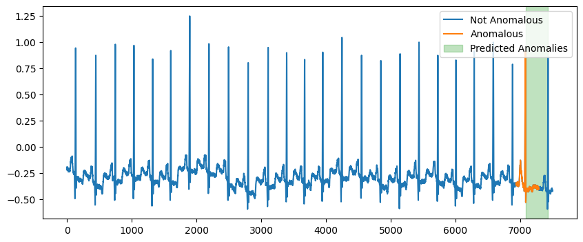
我们可以使用 Skchange 中的 Capa 来预测异常子序列。NorskRegnesentral/skchange。
Skchange 是一个由 Sktime 提供二级支持的软件包。
[ ]:
from skchange.anomaly_detectors.capa import CAPA

model = CAPA(max_segment_length=350)
model.fit(df["data"])
anomaly_intervals = model.predict(df["data"])
anomaly_intervals
0    [7084, 7425]
Name: anomaly_interval, dtype: interval
[ ]:
print("left: ", anomaly_intervals.ilocs[0].left)
print("right: ", anomaly_intervals.ilocs[0].right)
left:  7084
right:  7425
Capa 以一系列间隔的形式返回异常子序列。
绘制异常子序列。
[ ]:
fig, ax = plt.subplots(figsize=(10, 4))
ax.plot(df["data"], label="Not Anomalous")
ax.plot(df.loc[df["label"] == 1.0, "data"], label="Anomalous")

for interval in anomaly_intervals.ilocs:
    left = interval.left
    right = interval.right
    ax.axvspan(left, right, color="tab:green", alpha=0.3, label="Predicted Anomalies")

ax.legend()
<matplotlib.legend.Legend at 0x7fe0e4cfeb60>
变化点检测#
变化点检测用于查找时间序列中数据生成机制发生变化的点。
seatbelt 数据集显示了强制佩戴安全带后,道路上因事故死亡或重伤的人数变化。
[14]:
df = pd.read_csv(data_root / "seatbelts/seatbelts.csv", index_col=0, parse_dates=True)
df.head()
[14]:
| KSI | 标签 | |
|---|---|---|
| 1969-01-01 | 1687 | 0 |
| 1969-02-01 | 1508 | 0 |
| 1969-03-01 | 1507 | 0 |
| 1969-04-01 | 1385 | 0 |
| 1969-05-01 | 1632 | 0 |
绘制 seatbelt 数据集。
[15]:
fig, ax = plt.subplots(1, 1, figsize=(10, 3))
ax.plot(df["KSI"])

actual_cp = datetime.datetime(1983, 2, 1)
ax.axvline(
    actual_cp,
    color="tab:orange",
    linestyle="--",
    label="Wearing Seatbelts made Compulsory",
)
ax.legend()
ax.set_xlabel("Time")
ax.set_ylabel("KSI")
fig.savefig("seatbelt_example.png")
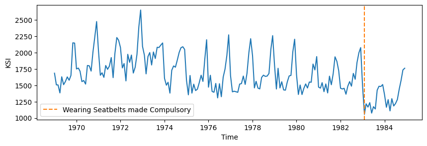
1983 年 1 月 31 日,英国强制佩戴安全带。
1968 年,所有新车都强制安装安全带。
使用二分分段法查找 KSI 下降 1000 个点的变化点。
[ ]:
from sktime.detection.bs import BinarySegmentation

model = BinarySegmentation(threshold=1000)
predicted_change_points = model.fit_predict(df["KSI"])
print(predicted_change_points)
0   1974-12-01
1   1983-01-01
dtype: datetime64[ns]
对于变化点检测器,predict 返回一个包含变化点索引的序列。
[ ]:
fig, ax = plt.subplots(figsize=(10, 4))
ax.plot(df["KSI"])
ax.axvline(
    actual_cp,
    label="Wearing Seatbelts Made Compulsory",
    color="tab:orange",
    linestyle="--",
)

for i, cp in enumerate(predicted_change_points.values.flatten()):
    label = "Predicted Change Points" if i == 0 else None
    ax.axvline(cp, color="tab:green", linestyle="--", label=label)

ax.set_ylabel("KSI")
ax.set_xlabel("Date")
ax.legend()
<matplotlib.legend.Legend at 0x7fe0cf024be0>
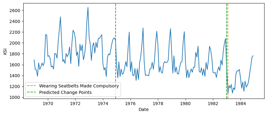
实际的变化点几乎被精确识别。
延伸阅读#
时间序列数据中的异常值/异常检测综述 https://arxiv.org/pdf/2002.04236
变化点检测算法综述 https://arxiv.org/abs/2003.06222
关于时间序列异常检测指标局限性的讨论 https://arxiv.org/pdf/2009.13807。
数据来源#
致谢:notebook - 异常点、变化点检测#
notebook 创建:alex-jg3(notebook 改编自 alex-jg3 在 ODSC 2024 的 notebook)
检测模块设计:fkiraly, miraep8, alex-jg3, lovkush-a, aiwalter, duydl, katiebuc, tveten
skchange:tveten, Norsk Regnesentral